HUBconnect

hubconnectdarklogo

This proof of concept was built around a simple question: Which contractors are we working with the most and who is communicating the most between these companies?

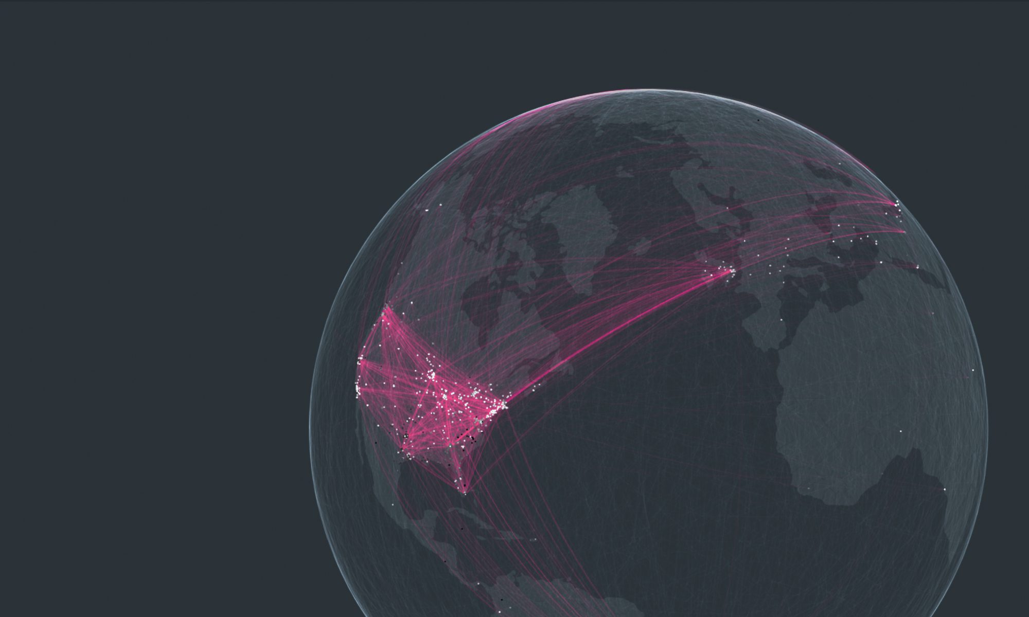
Based on email communication logs for 2018, email metadata was extracted from the Microsoft Graph API and stored in a custom database for analysis. The data model for the graphing tool was built by subsetting  the email domains for top contractors to isolate emails from/to those organizations and our internal addresses. We started with a list of 10 contractors, and added several more based on global analysis of the entire dataset.

1000000
Total Emails for 2018

=

10000000
Connections
CIRCLES (NODES)

Each circle depicts a user. The color depicts the company the user belongs within with grey for internal nodes. The size of the circle depicts the total number of connections by weight. 

LINES (LINKS)

The weight of the line between two nodes indicates the volume of connection between any pair of nodes. If the line is dashed, it means that communication is largely one-sided.

FILTERS
CHART

The chart from hovering over a node will show the direction and volume of communications logged for each connection. The left side is received and right side is sent.

Single Company View

The top 5 internal nodes and top 5 external nodes are displayed in the inner ring. Curved links denote a connection to a top connection for this company.